
Views: 0 Author: Site Editor Publish Time: 2026-10-30 Origin: Site

A brand-specific hair color chart is a critical asset for professional consistency and client conversion. It bridges the gap between a stylist's creative vision and the final chemical result. Distinguishing your professional hair color cream line from generic, off-the-shelf alternatives remains a major business challenge today. Without a dedicated visual guide, salons struggle to predict outcomes accurately. This uncertainty often leads to costly color corrections and lost client trust.
The ultimate goal is establishing a visual and technical standard. This standard reinforces brand authority and simplifies the color selection process for stylists. In this comprehensive guide, you will learn how to design, produce, and scale a custom chart. We will explore everything from defining your color architecture to ensuring compliance and driving salon adoption.
Aligning technical formulas with visual representations is essential for color accuracy.
Strategic organization of a professional hair color chart impacts salon adoption and product workflow.
Data-backed design ensures your chart serves as a functional tool rather than just marketing collateral.
Scalability and compliance: Building a chart that accommodates future color extensions while meeting industry labeling standards.
Creating a reliable color architecture forms the foundation of your brand. You must build a logical system. It helps stylists navigate your portfolio quickly and confidently.
You should organize your shades logically. Most brands utilize the International Color Chart (ICC) numerical system. This universally recognized framework categorizes shades by depth and tone. Proper segmentation prevents confusion at the mixing bowl. We recommend dividing your portfolio into three primary pillars:
Depth (Level System): Categorize colors from 1 (Black) to 10 (Lightest Blonde). This dictates how dark or light the color appears.
Undertone (Primary Tone): Group shades by their dominant pigment. Examples include Ash, Gold, Copper, or Mahogany.
Saturation (Secondary Tone): Define the intensity or reflect. This shows stylists how vivid or muted the final result will be.
Technical benchmarks anchor your visual guide to reality. You must establish the exact relationship between your permanent hair color cream formulations and the final outcome. A level 6 Ash in your line might behave differently than a competitor's level 6 Ash. Your chart must reflect these proprietary nuances. Document the exact underlying pigment each formula neutralizes or enhances. Provide clear guidelines on how your ammonia or ammonia-free options perform on virgin hair versus previously colored hair.
You must define what "accurate" means for your brand. Color accuracy is highly subjective unless you standardize the testing environment. Establish a rigorous swatching process. Test your formulas on standardized white synthetic hair and natural human hair swatches. Observe these results under specific lighting conditions. We suggest evaluating colors under daylight bulbs (around 5000K to 5500K). This ensures the colors printed in your marketing materials match the physical swatches exactly. Consistency across print and digital mediums builds immense trust among salon professionals.
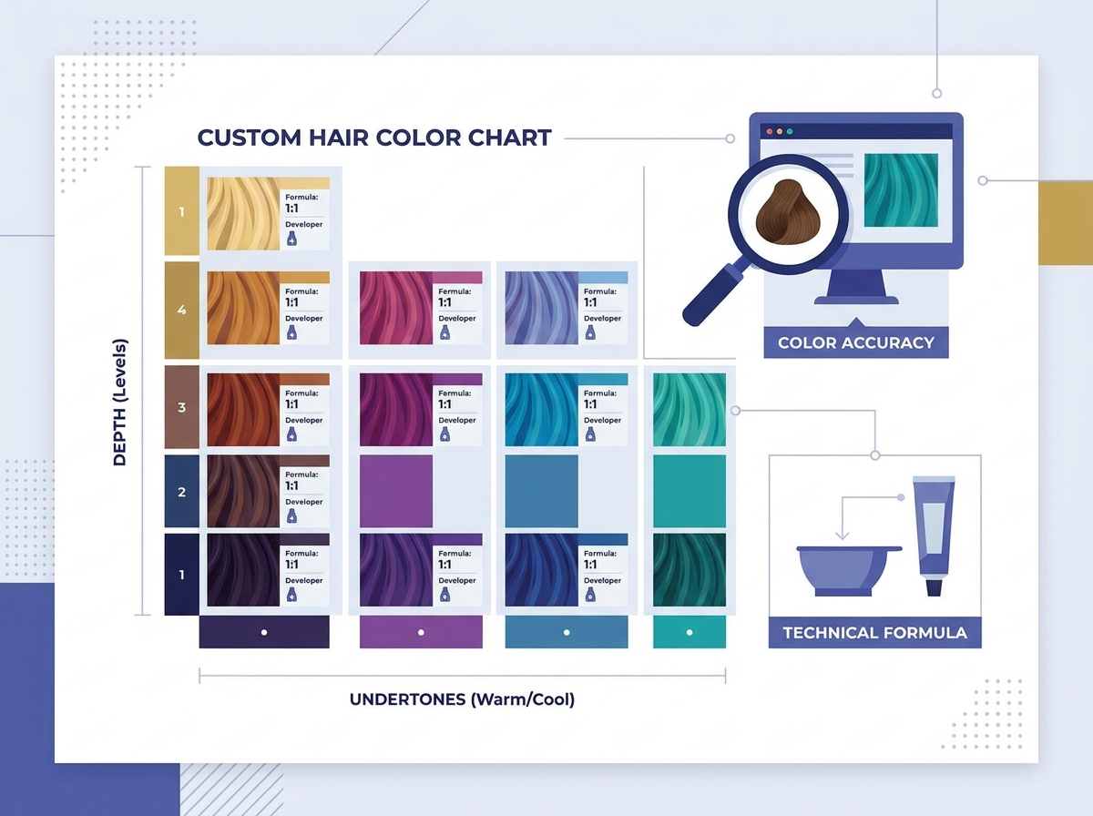
A successful guide goes beyond mere aesthetics. It acts as a comprehensive technical manual. Stylists rely on it daily to formulate complex color recipes.
Physical swatches remain superior to digital approximations for professional applications. Screens display colors in RGB, which varies wildly between devices. A stylist cannot trust a tablet screen to formulate a precise platinum blonde. Physical swatches show actual light reflection, depth, and texture. They provide a tactile, accurate representation of your product.
Feature | Physical Swatches | Digital Approximations |
|---|---|---|
Color Accuracy | High (reflects real-world light) | Variable (depends on screen calibration) |
Texture Assessment | Yes (tactile feedback) | No (flat visual only) |
Salon Usability | Excellent for client consultations | Good for quick reference or ordering |
Production Cost | Higher (requires manufacturing) | Lower (easy to update instantly) |
Your professional hair color chart must include vital mixing instructions. Embed developer ratios directly next to the color families. Clarify whether a specific high-lift series requires a 1:1.5 or 1:2 mixing ratio. Include standard processing times for grey coverage, tonal shifts, and lifting. Add an undertone neutralization guide. A simple color wheel printed on the inside cover helps stylists quickly identify which complimentary tone cancels out unwanted warmth.
Ensure your materials reflect actual product performance. Hair porosity heavily influences final color results. Your guide should acknowledge this reality. Include brief notes on how your permanent color performs on porous, damaged hair versus healthy, resistant hair. Provide a starting level guide. Show what a level 7 Copper looks like when applied over a natural level 5 versus a pre-lightened level 9. This systemic consistency prevents unpredictable results and boosts user confidence.
Manufacturing your guide requires careful attention to detail. The materials must withstand harsh salon environments. They must also meet strict industry regulations.
You must balance high-fidelity printing requirements with web-accessible digital versions. For physical production, use CMYK color matching. Work closely with print vendors who specialize in cosmetic color reproduction. Request hard proofs before authorizing a full print run. Simultaneously, develop a high-resolution digital PDF. Calibrate the digital version to match the physical copy as closely as possible. Salons often use the digital version for inventory management, while keeping the physical book at the color bar.
Durability is non-negotiable for high-use salon environments. Stylists work around water, bleach, developers, and dyes all day. Flimsy paper will not survive.
Moisture Resistance: Use heavy-stock paper coated with a matte or gloss lamination. This allows stylists to wipe away accidental spills easily.
Chemical Resistance: UV-coated pages offer superior protection against color staining and chemical degradation.
Binding Quality: Opt for sturdy ring binders or reinforced fold-out panels. Bound books often tear at the spine after heavy daily use.
You must ensure the layout meets regulatory requirements. Different regions require specific ingredient disclosures and safety warnings. For example, the FDA and the EU have strict guidelines regarding hair dye labeling. Incorporate these mandatory warnings clearly, but avoid cluttering the user interface. Place extensive legal text, allergy alert instructions, and safety precautions on the back cover or a dedicated index page. Keep the main swatch pages clean and focused entirely on color formulation.
Creating a beautiful guide solves only half the problem. You must drive adoption. Salons need to integrate your tool into their daily operations seamlessly.
Educate salon professionals on using your chart to achieve predictable results. Host hands-on workshops or virtual webinars. Do not just hand them the book. Show them how to navigate it. Walk them through specific scenarios, such as transitioning a client from brunette to blonde using your high-lift series. When stylists understand the logic behind your layout, they adopt the brand much faster.
Align the physical guide with your brand’s training modules. Your technical support materials should directly reference the pages and sections of the chart. If you launch a video tutorial on grey coverage, the educator should point to the exact natural series swatches in the book. Create a seamless loop between your educational content and the physical tool. This reinforces learning and builds brand loyalty.
Identify common user errors and incorporate visual cues to prevent mistakes. Many stylists accidentally misread developer levels when rushing. Use distinct color-coding for different developer strengths (e.g., blue for 10-volume, green for 20-volume). Add clear icons next to shades formulated specifically for 100% grey coverage. Highlight shades not recommended for use on previously bleached hair. These small visual interventions significantly reduce costly color corrections.
Your brand will evolve. You will introduce new seasonal trends, toners, and shade extensions. Your physical guide must accommodate this growth.
Design a layout allowing for the addition of new shades without a total redesign. A modular approach saves significant printing costs. Ring-bound systems work best for growing brands. You can simply print a new single page for a specialized pastel collection and mail it to your partner salons. They snap the new page into their existing binder. Avoid rigid, perfectly bound books if you plan to launch new products within the next twelve months.
Establish a strict protocol for quality control. Whenever you introduce new product batches or colors, you must verify accuracy. Sometimes, a new dye supplier changes the viscosity or undertone of a raw ingredient. Test the new batch against the original master swatches in your hair color chart. If a discrepancy exists, you must adjust the chemical formula or update the physical swatch immediately. Never let a mismatched swatch reach a salon.
Scaling requires coordination among multiple stakeholders. Follow this checklist to manage updates efficiently:
Select design partners experienced in cosmetic color reproduction.
Approve technical copy and developer ratios with your lead chemist.
Produce a small prototype batch of the new physical swatches.
Conduct final testing with a focus group of experienced colorists.
Gather feedback on usability before authorizing mass production.
A custom hair color chart is a long-term investment in brand equity and customer satisfaction. It serves as the ultimate communication tool between your laboratory and the salon floor. By focusing on technical precision and ease of use, you turn this guide into an indispensable tool. It empowers stylists to achieve flawless results.
To maximize your return on investment, take these action-oriented next steps: First, audit your current color portfolio and identify any gaps in your level system. Next, establish a standardized lighting environment to evaluate all future swatches. Finally, design your layout with modularity in mind to accommodate upcoming product launches seamlessly. Equip your salon partners with the right visual tools, and they will reward you with long-term loyalty.
A: A custom guide highlights your brand-specific formulas and proprietary technology. Generic guides fail to capture the unique pigment loads, base formulations, and conditioning agents of your specific line. Customizing ensures stylists see exactly how your color performs, increasing predictable results and brand trust.
A: You should update your guide whenever you launch new shade extensions or alter existing chemical formulas. For modular ring-bound systems, provide page updates immediately upon product release. Plan a full aesthetic and structural review every two to three years to ensure materials remain modern and durable.
A: The most significant risks include color shift issues and poor print fidelity. If the synthetic swatches do not match the actual dye results, stylists will ruin client hair. Using cheap, non-laminated paper also guarantees the guide will degrade quickly in a wet, chemical-heavy salon environment.
A: No, a digital version cannot fully replace a physical guide. Digital versions offer visual inspiration and quick inventory reference. However, device screens alter color perception drastically. Physical swatches provide the tactile, light-accurate technical reference required for precise professional formulation.


